先看下jupyter和pycharm环境的差别
左边是jupyter----------------------------------------------------------右边是pycharm
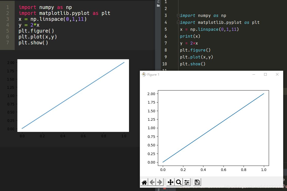
以下都是使用pycharm环境
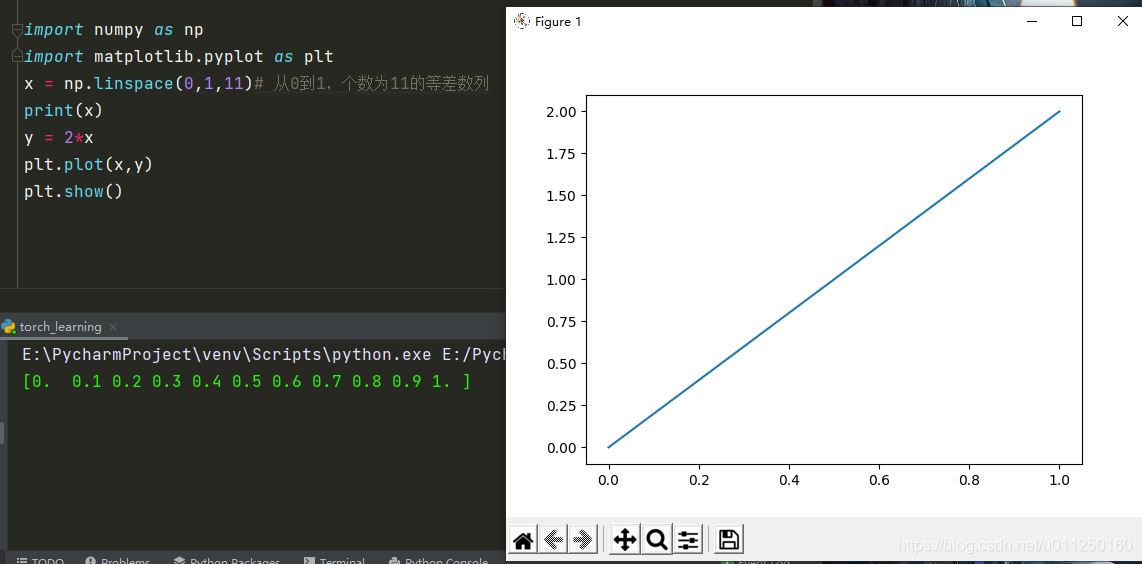
1.一个窗口画出一个线性方程
import numpy as np
import matplotlib.pyplot as plt
x = np.linspace(0,1,11)# 从0到1,个数为11的等差数列
print(x)
y = 2*x
plt.plot(x,y)
plt.show()
2.两个窗口分别画出一个线性方程
import numpy as np
import matplotlib.pyplot as plt
x = np.linspace(0,1,11)# 从0到1,个数为11的等差数列
y1 = 2*x
y2 = 3*x
# 一个figure就是一个窗口
plt.figure()
plt.plot(x,y1)
# 一个figure就是一个窗口
plt.figure()
plt.plot(x,y2)
# 显示
plt.show()
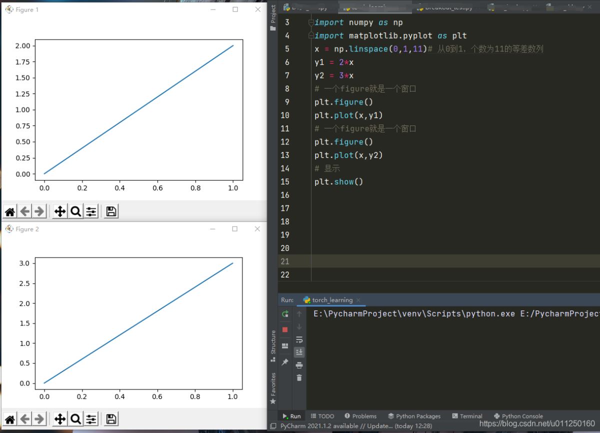
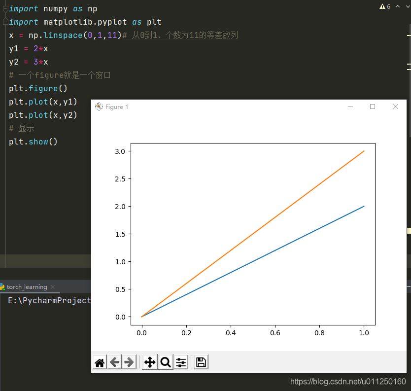
3.一个窗口画出两个线性方程
import numpy as np
import matplotlib.pyplot as plt
x = np.linspace(0,1,11)# 从0到1,个数为11的等差数列
y1 = 2*x
y2 = 3*x
# 一个figure就是一个窗口
plt.figure()
plt.plot(x,y1)
plt.plot(x,y2)
# 显示
plt.show()
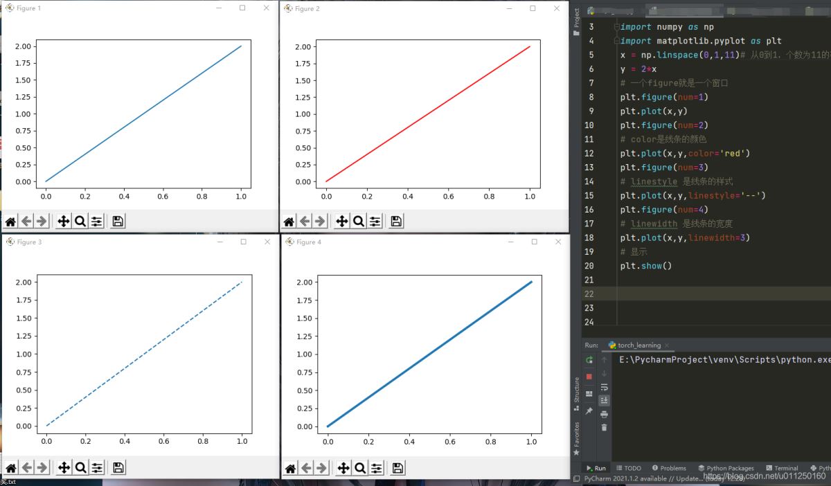
4.定义画图的样式
import numpy as np
import matplotlib.pyplot as plt
x = np.linspace(0,1,11)# 从0到1,个数为11的等差数列
y = 2*x
# 一个figure就是一个窗口
plt.figure(num=1)
plt.plot(x,y)
plt.figure(num=2)
# color是线条的颜色
plt.plot(x,y,color='red')
plt.figure(num=3)
# linestyle 是线条的样式
plt.plot(x,y,linestyle='--')
plt.figure(num=4)
# linewidth 是线条的宽度
plt.plot(x,y,linewidth=3)
# 显示
plt.show()
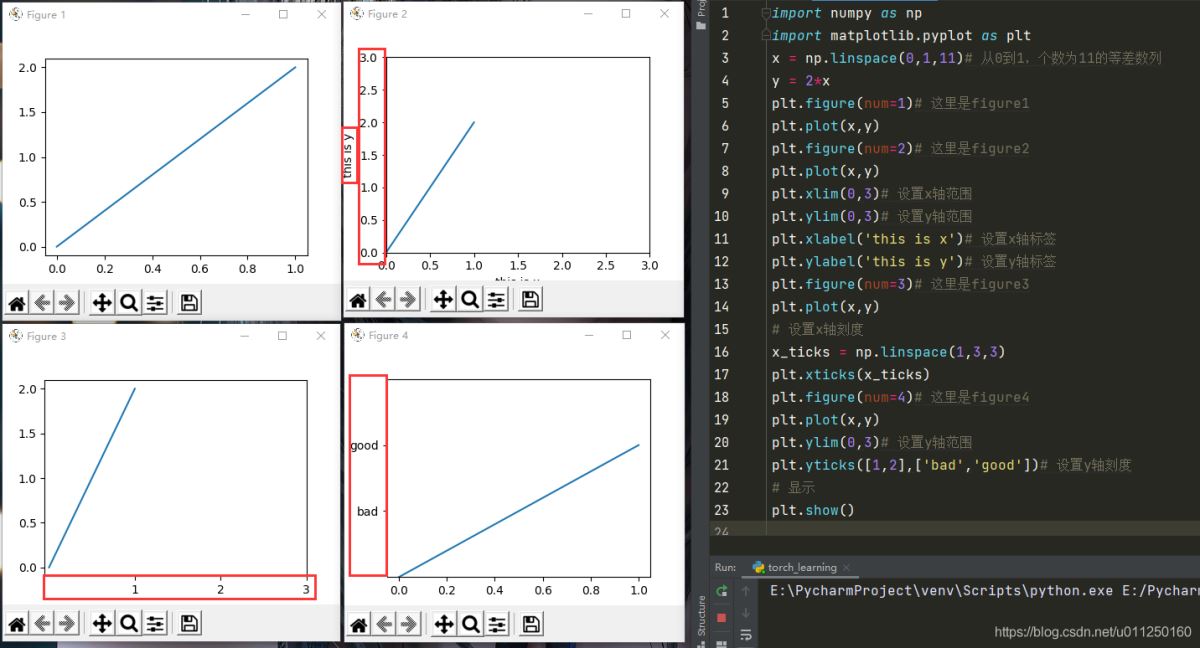
5.设置xy轴的范围,标签,刻度
import numpy as np
import matplotlib.pyplot as plt
x = np.linspace(0,1,11)# 从0到1,个数为11的等差数列
y = 2*x
plt.figure(num=1)# 这里是figure1
plt.plot(x,y)
plt.figure(num=2)# 这里是figure2
plt.plot(x,y)
plt.xlim(0,3)# 设置x轴范围
plt.ylim(0,3)# 设置y轴范围
plt.xlabel('this is x')# 设置x轴标签
plt.ylabel('this is y')# 设置y轴标签
plt.figure(num=3)# 这里是figure3
plt.plot(x,y)
# 设置x轴刻度
x_ticks = np.linspace(1,3,3)
plt.xticks(x_ticks)
plt.figure(num=4)# 这里是figure4
plt.plot(x,y)
plt.ylim(0,3)# 设置y轴范围
plt.yticks([1,2],['bad','good'])# 设置y轴刻度
# 显示
plt.show()
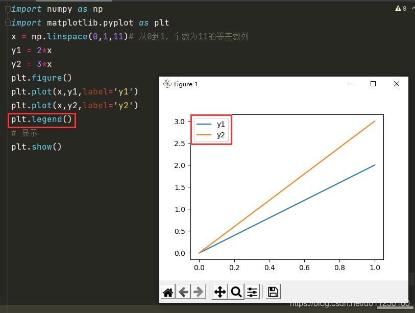
6.设置图例
import numpy as np
import matplotlib.pyplot as plt
x = np.linspace(0,1,11)# 从0到1,个数为11的等差数列
y1 = 2*x
y2 = 3*x
plt.figure()
plt.plot(x,y1,label='y1')
plt.plot(x,y2,label='y2')
plt.legend()
# 显示
plt.show()
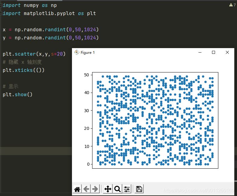
7.散点图
import numpy as np
import matplotlib.pyplot as plt

x = np.random.randint(0,50,1024)
y = np.random.randint(0,50,1024)

plt.scatter(x,y,s=20)
# 隐藏 x 轴刻度
plt.xticks(())
# 显示
plt.show()
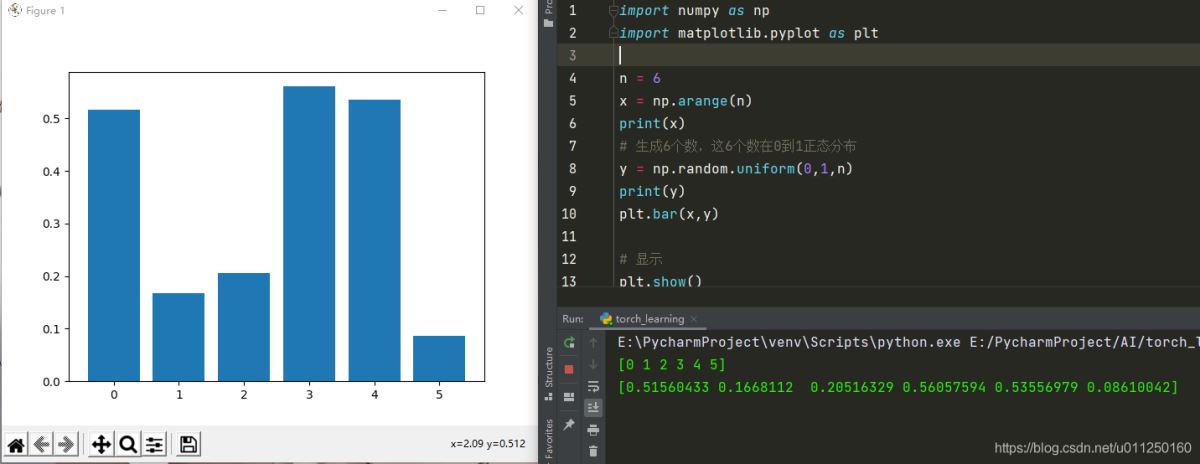
8.柱状图
import numpy as np
import matplotlib.pyplot as plt

n = 6
x = np.arange(n)
print(x)
# 生成6个数,这6个数在0到1正态分布
y = np.random.uniform(0,1,n)
print(y)
plt.bar(x,y)

# 显示
plt.show()
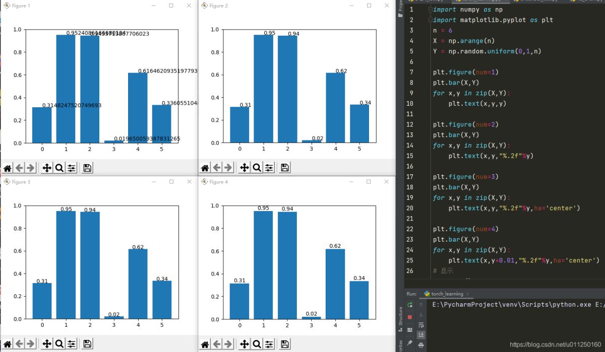
9.柱状图显示高度
import numpy as np
import matplotlib.pyplot as plt
n = 6
X = np.arange(n)
Y = np.random.uniform(0,1,n)

plt.figure(num=1)
plt.bar(X,Y)
for x,y in zip(X,Y):
    plt.text(x,y,y)

plt.figure(num=2)
plt.bar(X,Y)
for x,y in zip(X,Y):
    plt.text(x,y,"%.2f"%y)

plt.figure(num=3)
plt.bar(X,Y)
for x,y in zip(X,Y):
    plt.text(x,y,"%.2f"%y,ha='center')

plt.figure(num=4)
plt.bar(X,Y)
for x,y in zip(X,Y):
    plt.text(x,y+0.01,"%.2f"%y,ha='center')
# 显示
plt.show()
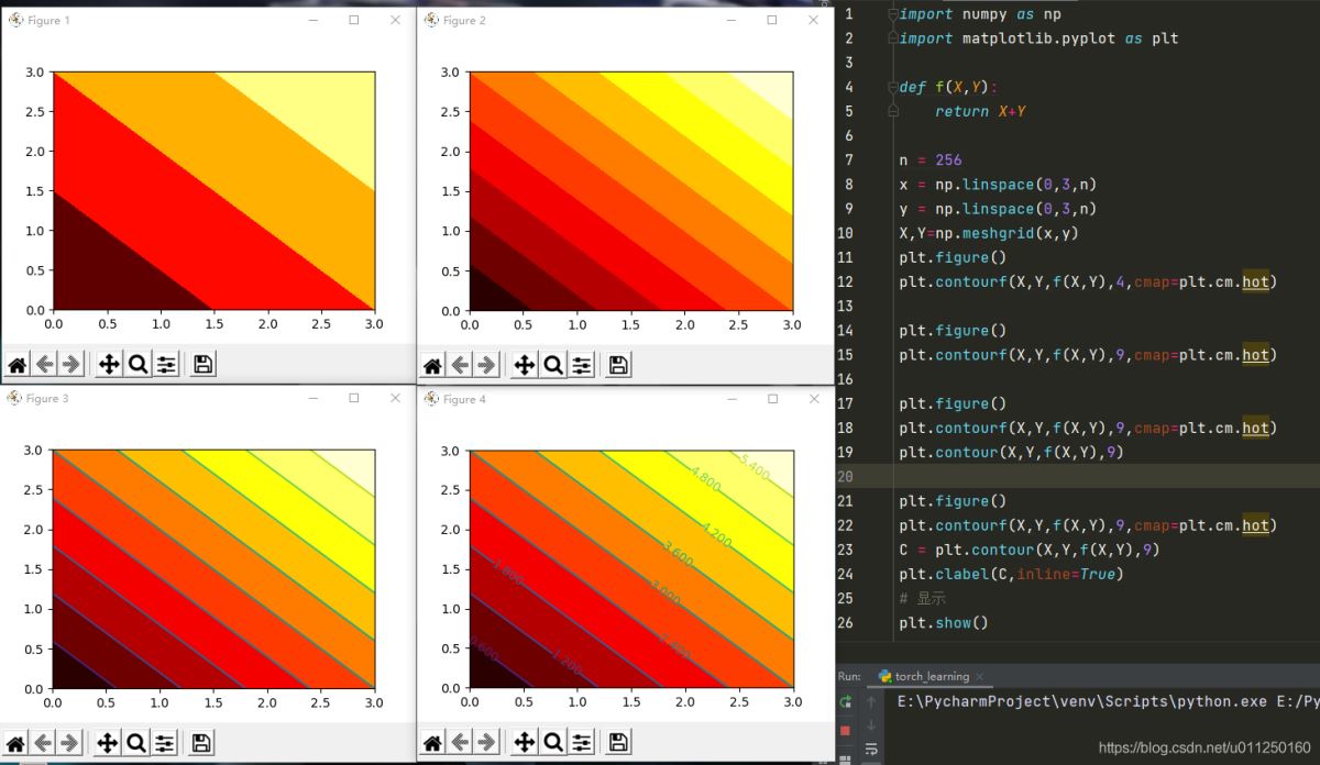
10.等高线图
import numpy as np
import matplotlib.pyplot as plt

def f(X,Y):
    return X+Y

n = 256
x = np.linspace(0,3,n)
y = np.linspace(0,3,n)
X,Y=np.meshgrid(x,y)
plt.figure()
plt.contourf(X,Y,f(X,Y),4,cmap=plt.cm.hot)

plt.figure()
plt.contourf(X,Y,f(X,Y),9,cmap=plt.cm.hot)

plt.figure()
plt.contourf(X,Y,f(X,Y),9,cmap=plt.cm.hot)
plt.contour(X,Y,f(X,Y),9)

plt.figure()
plt.contourf(X,Y,f(X,Y),9,cmap=plt.cm.hot)
C = plt.contour(X,Y,f(X,Y),9)
plt.clabel(C,inline=True)
# 显示
plt.show()
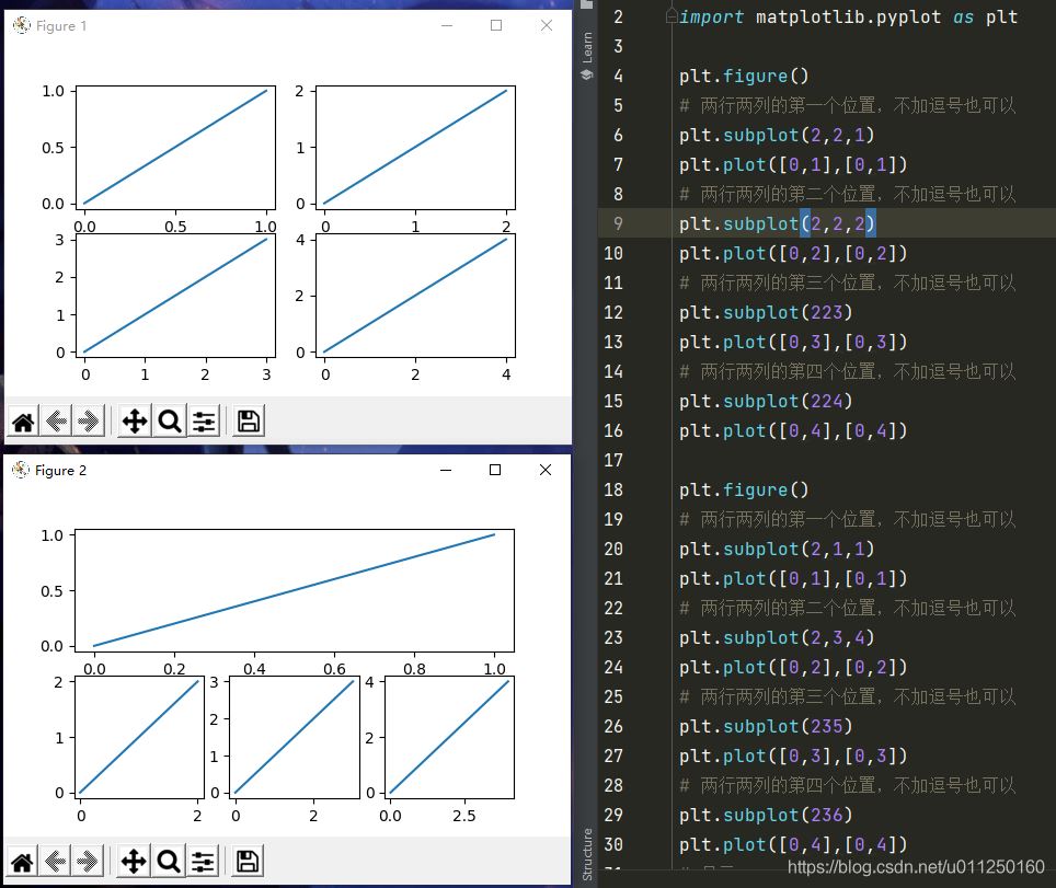
11.一个窗口多个子图
import matplotlib.pyplot as plt

plt.figure()
# 两行两列的第一个位置,不加逗号也可以
plt.subplot(2,2,1)
plt.plot([0,1],[0,1])
# 两行两列的第二个位置,不加逗号也可以
plt.subplot(2,2,2)
plt.plot([0,2],[0,2])
# 两行两列的第三个位置,不加逗号也可以
plt.subplot(223)
plt.plot([0,3],[0,3])
# 两行两列的第四个位置,不加逗号也可以
plt.subplot(224)
plt.plot([0,4],[0,4])

plt.figure()
# 两行两列的第一个位置,不加逗号也可以
plt.subplot(2,1,1)
plt.plot([0,1],[0,1])
# 两行两列的第二个位置,不加逗号也可以
plt.subplot(2,3,4)
plt.plot([0,2],[0,2])
# 两行两列的第三个位置,不加逗号也可以
plt.subplot(235)
plt.plot([0,3],[0,3])
# 两行两列的第四个位置,不加逗号也可以
plt.subplot(236)
plt.plot([0,4],[0,4])
# 显示
plt.show()
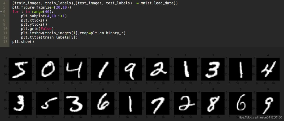
12.常用子图显示
plt.figure(figsize=(20,10))
for i in range(40):
    plt.subplot(4,10,i+1)
    plt.xticks()
    plt.yticks()
    plt.grid(False)
    plt.imshow(train_images[i],cmap=plt.cm.binary_r)
    plt.title(train_labels[i])
plt.show()
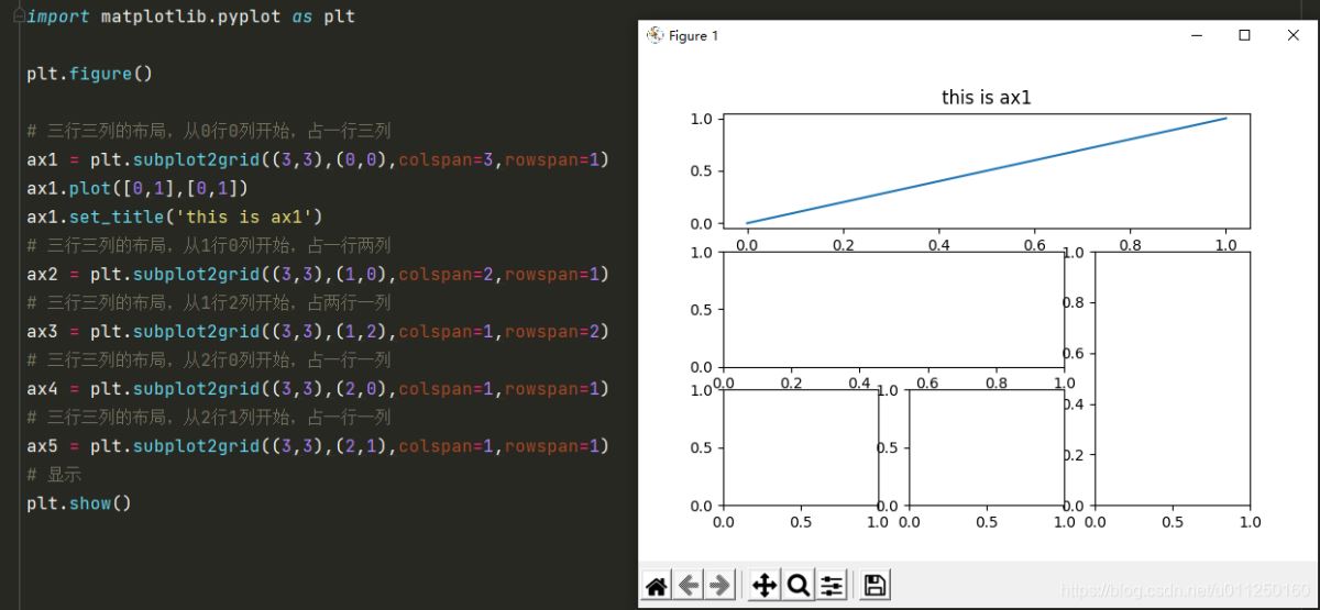
13.格子布局放置子图
import matplotlib.pyplot as plt

plt.figure()

# 三行三列的布局,从0行0列开始,占一行三列
ax1 = plt.subplot2grid((3,3),(0,0),colspan=3,rowspan=1)
ax1.plot([0,1],[0,1])
ax1.set_title('this is ax1')
# 三行三列的布局,从1行0列开始,占一行两列
ax2 = plt.subplot2grid((3,3),(1,0),colspan=2,rowspan=1)
# 三行三列的布局,从1行2列开始,占两行一列
ax3 = plt.subplot2grid((3,3),(1,2),colspan=1,rowspan=2)
# 三行三列的布局,从2行0列开始,占一行一列
ax4 = plt.subplot2grid((3,3),(2,0),colspan=1,rowspan=1)
# 三行三列的布局,从2行1列开始,占一行一列
ax5 = plt.subplot2grid((3,3),(2,1),colspan=1,rowspan=1)
# 显示
plt.show()
以上就是python可视化数据plt库实例的详细内容,更多关于python可视化数据plt库的资料请关注脚本之家其它相关文章!
您可能感兴趣的文章:- 利用Python进行数据可视化的实例代码
- python数据可视化之matplotlib.pyplot基础以及折线图
- 浅谈哪个Python库才最适合做数据可视化
- 学会Python数据可视化必须尝试这7个库
- Python中seaborn库之countplot的数据可视化使用
- python实现股票历史数据可视化分析案例
- Python数据可视化之基于pyecharts实现的地理图表的绘制
- Python爬虫实战之爬取京东商品数据并实实现数据可视化
- Python数据可视化之用Matplotlib绘制常用图形
- Python数据可视化之绘制柱状图和条形图
- python用pyecharts实现地图数据可视化
- python数据可视化 – 利用Bokeh和Bottle.py在网页上展示你的数据
